

Smart Dental Health Option
Deliverables
Brand Identity
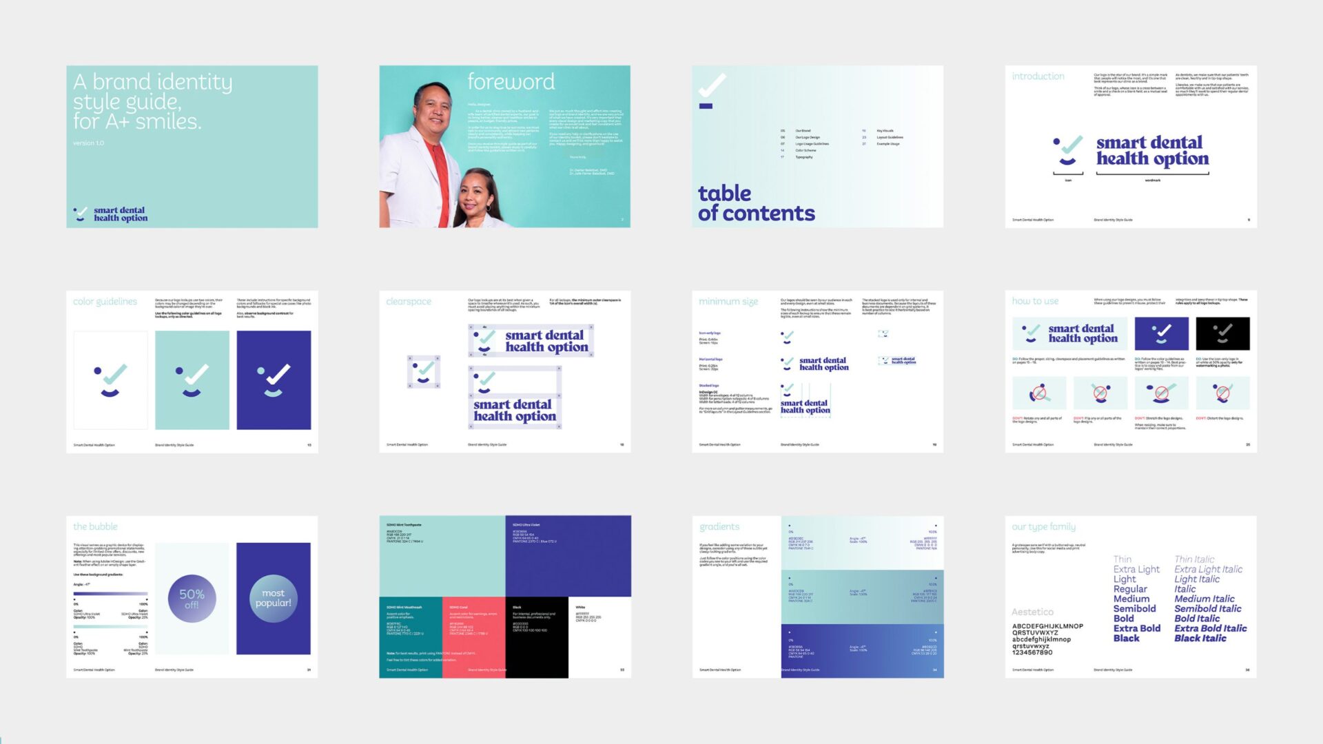
Brand Guidelines
Design Direction
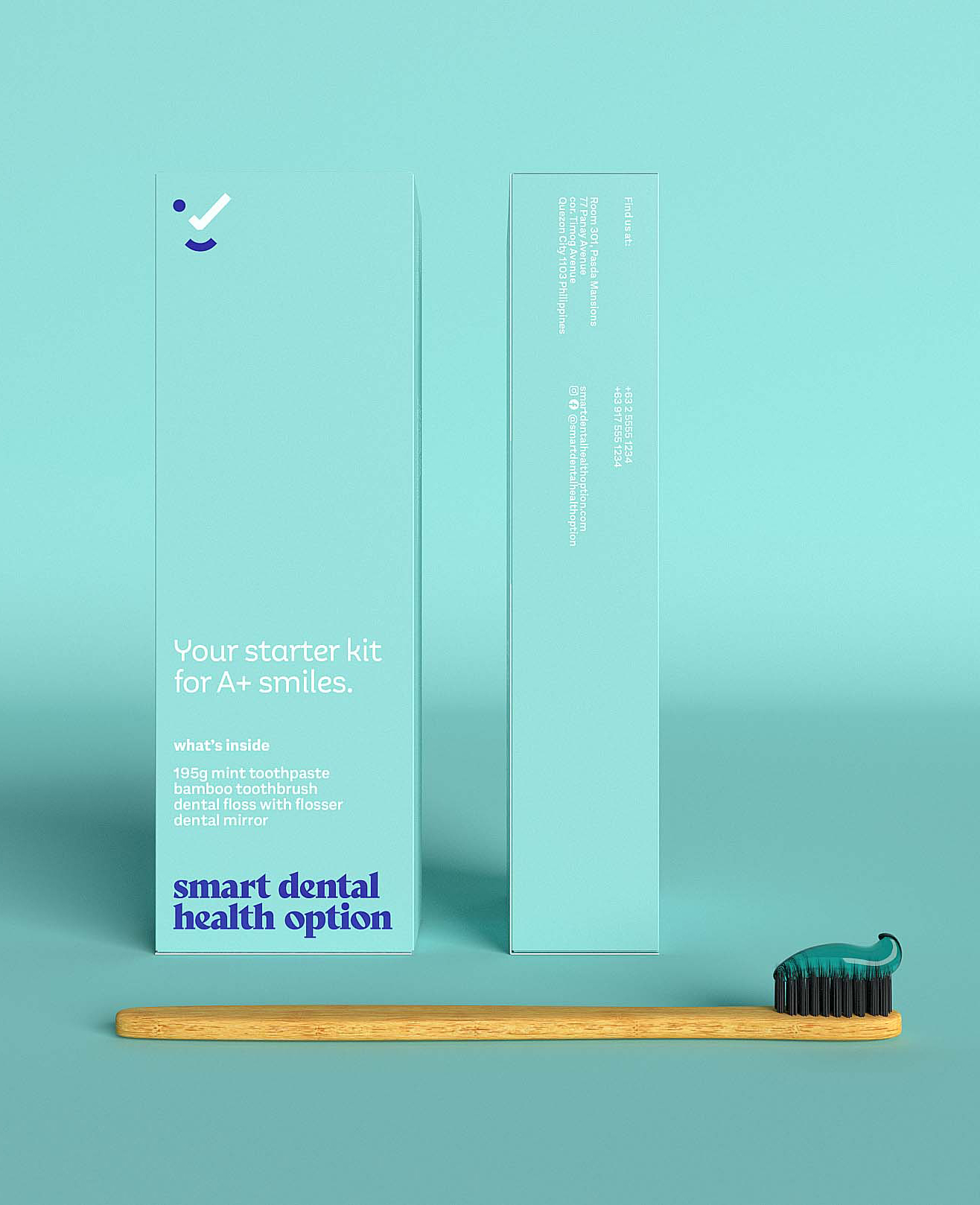
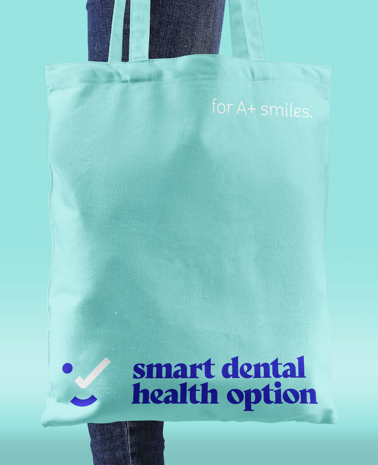
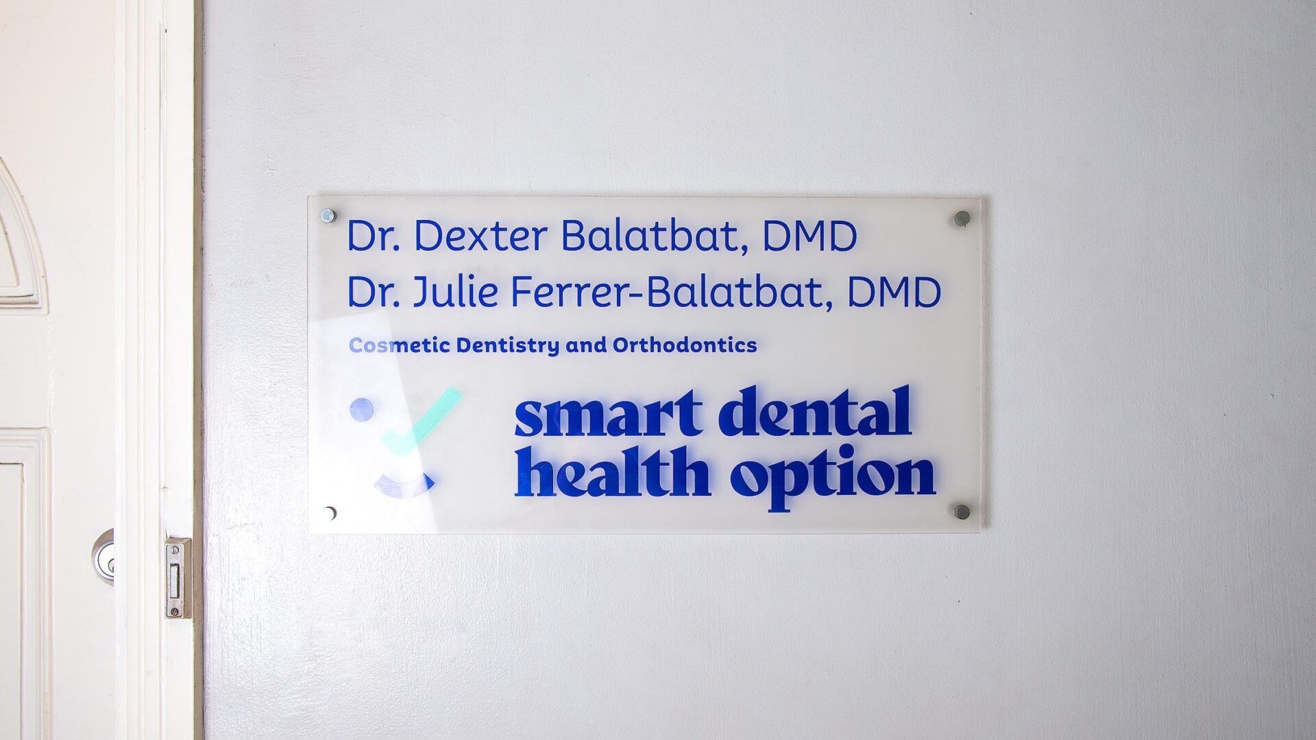
Print Design
Advertising Design
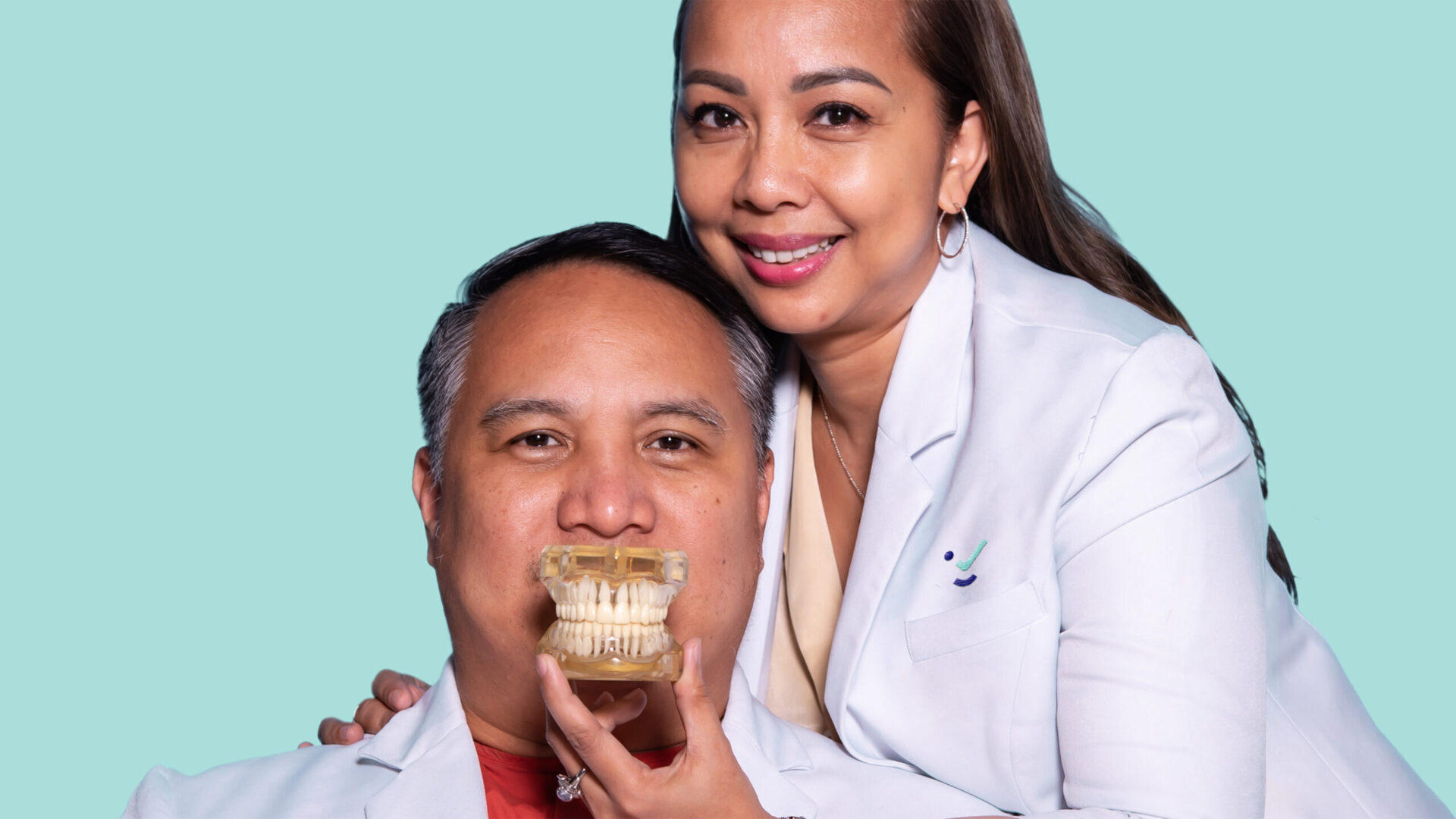
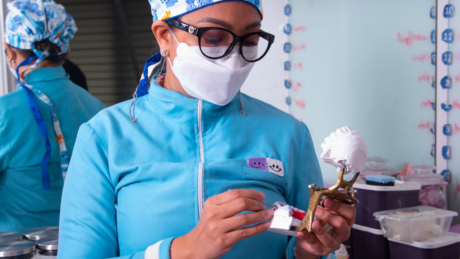
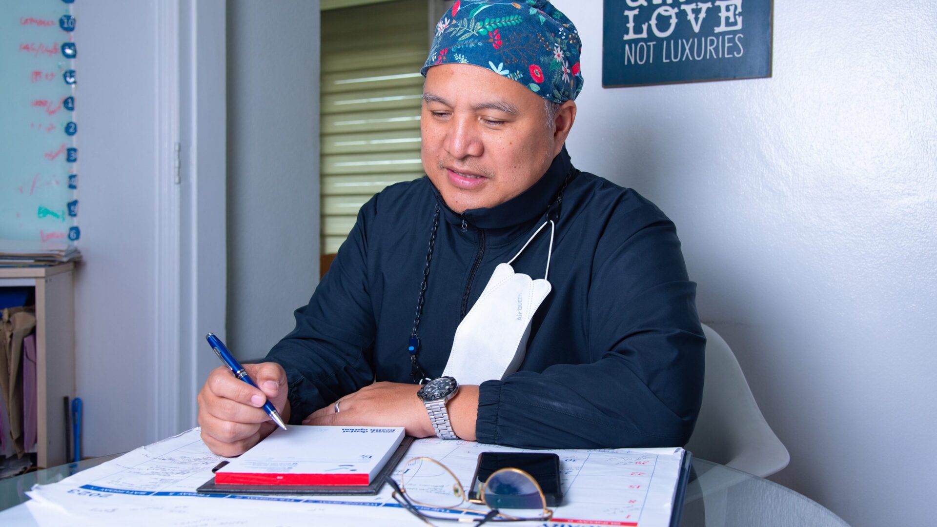
Smart Dental Health Option is a dental clinic located between the South and West Triangle districts of Quezon City. Owned and operated by Drs. Dexter and Julie Balatbat, DMD, a husband-and-wife duo of dentists, the clinic was founded with a goal to provide expert-quality dental care at affordable prices.
A longtime client of the clinic, I was given by its dentists the honor of redesigning its logo and creating an accompanying brand identity.
The project came as it celebrated its 25th year in business, with expansion plans, a change in location, and even a new name planned in the near future.
Background
A Check for Transformation
Upon auditing the clinic’s then-current branding at the start of the project, the dentists and I found that not only did it use two different brand marks but it also lacked visual coherence and hierarchy when viewed as a whole.
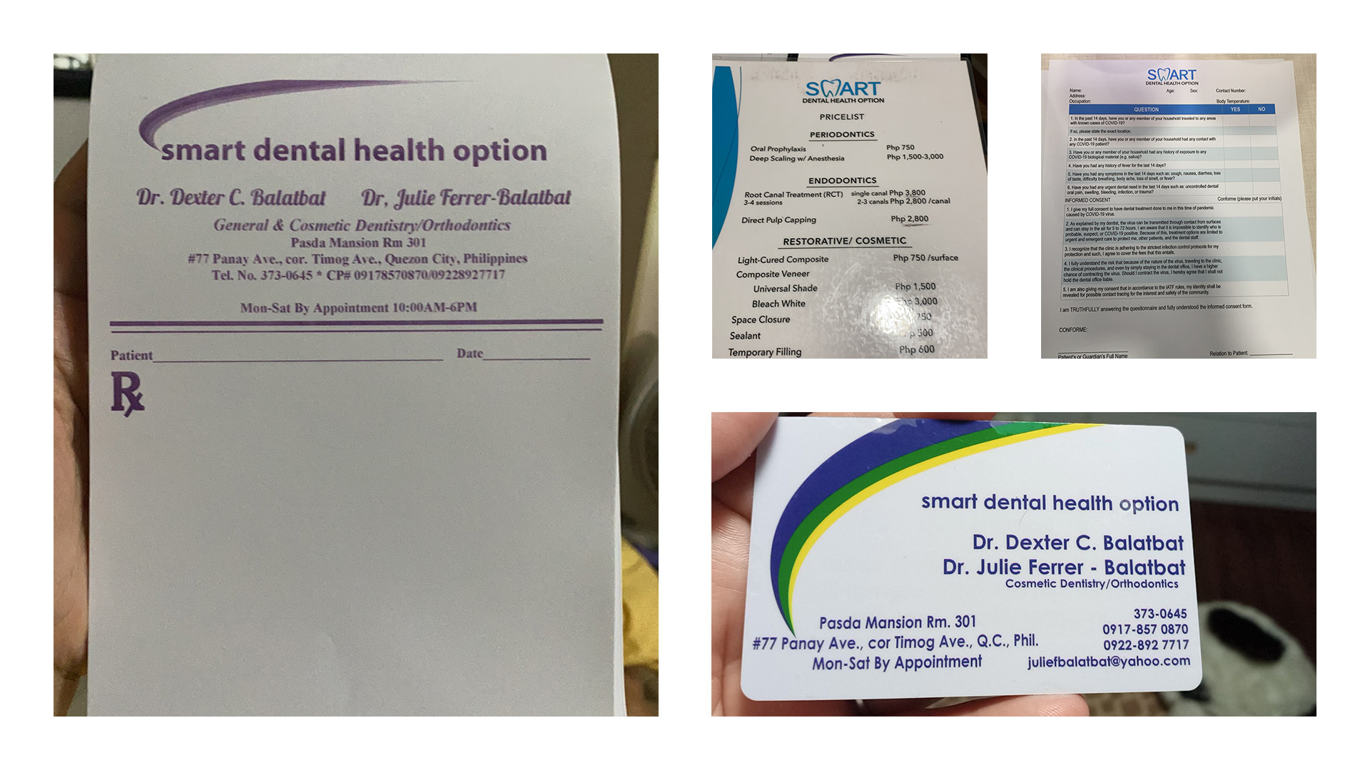
Samples of old identity
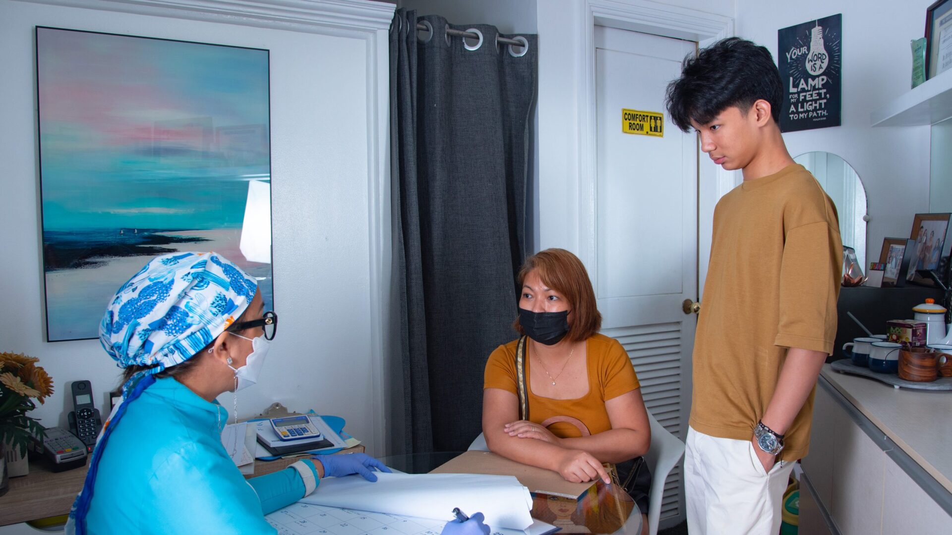
Because families and children are the clinic’s target market, the objectives of this project is to position the clinic as a safe, shame-free space for patients to get their dental health and hygeine fix and to establish an overall brand experience that is empathic, respectable and competent.
Approach
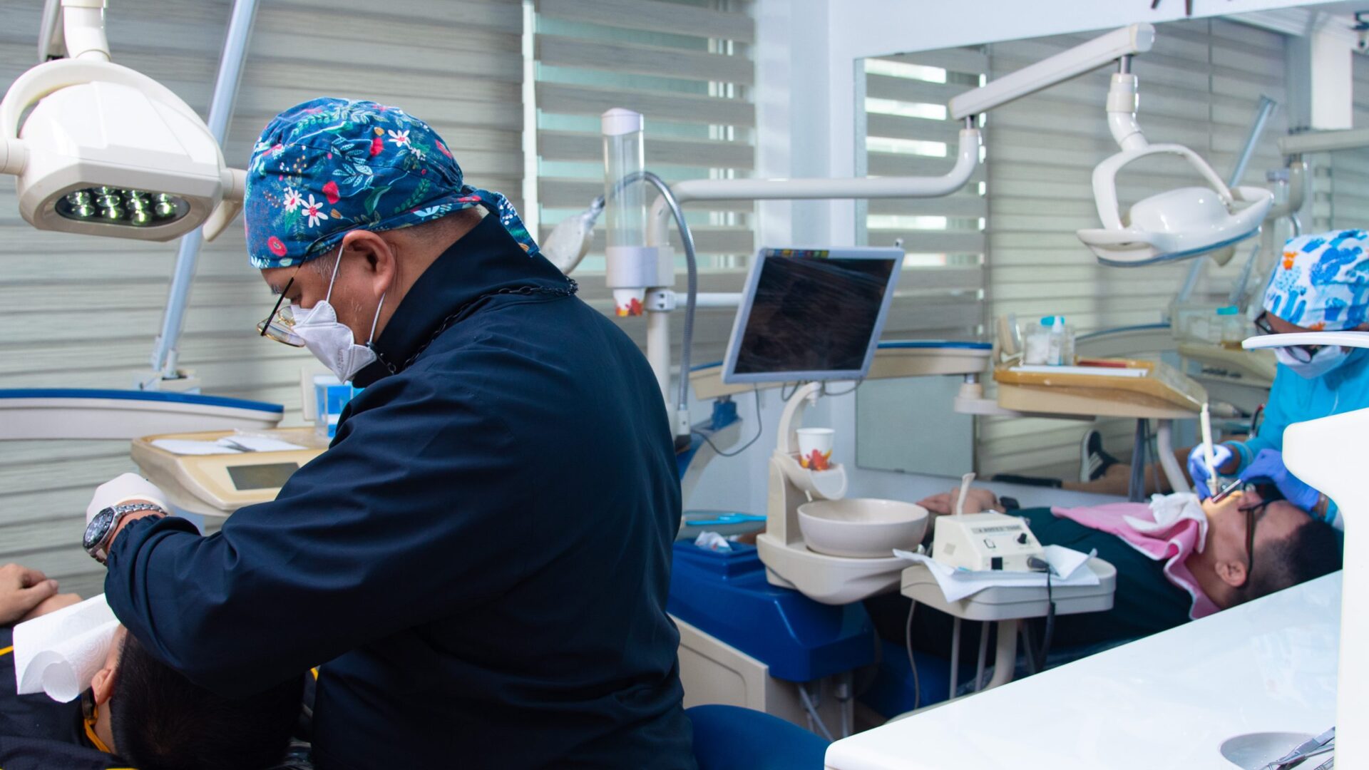
Led by a memorably friendly brand mark, the Smart Dental Health Option brand identity not only has a more unified look and feel, but also conveys the expert service and conducive environment patients can expect from the clinic.
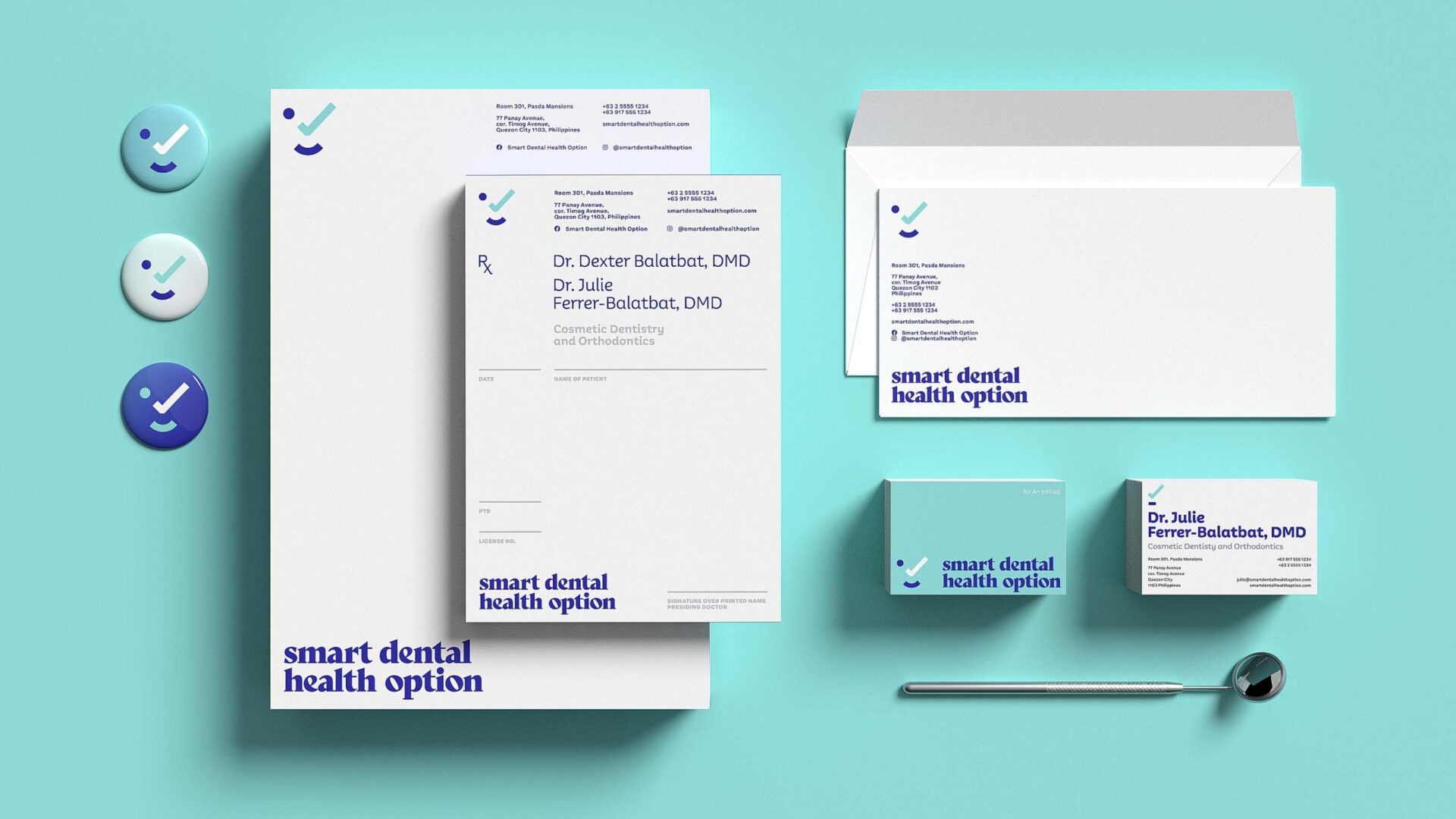

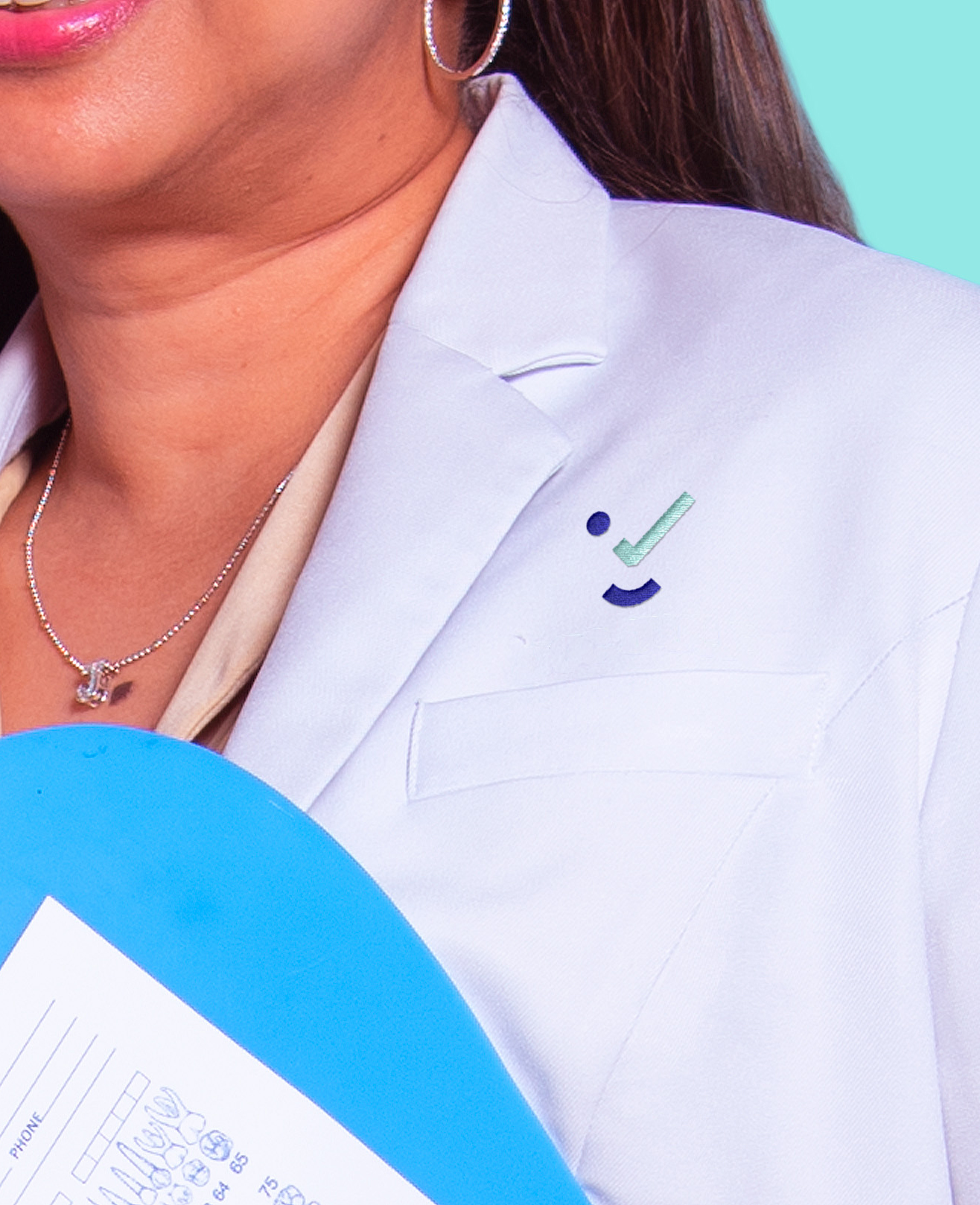


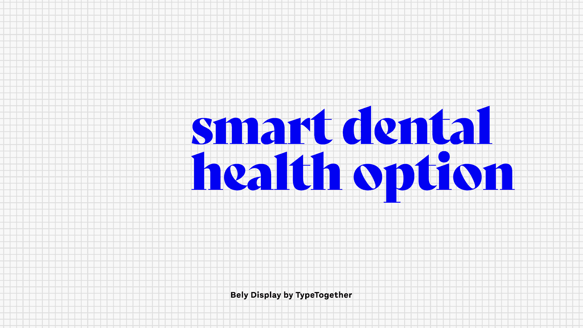
Brand mark
A Check for Healthy Smiles
A cross between a check and a smile, the clinic’s icon is a symbol of quality assurance, the mutual satisfaction between a dentist and their patient, and — of course — clean and healthy smiles.


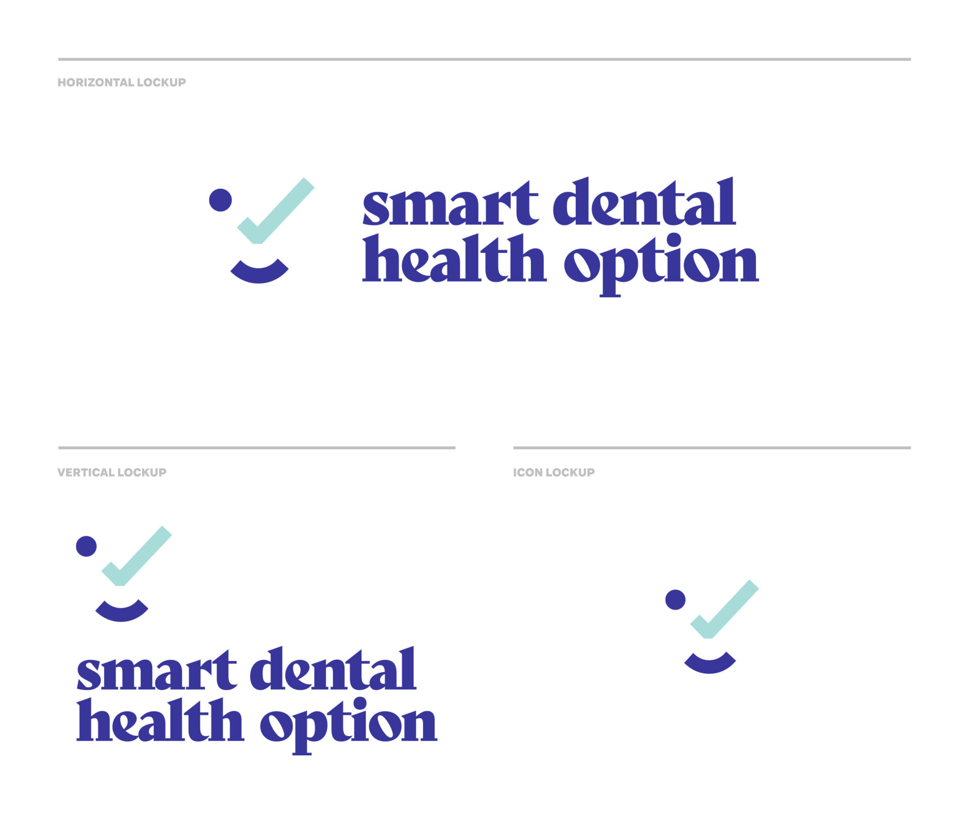
Identity
A Check for Tip-Top Shape
The identity combines a character-driven workhorse type family with a palette of cool hues, serene gradients and strong accents to create a serene yet trustworthy look and feel that best represents the clinic, its staff and the values it stands for.


Credits
Thanks to Drs. Dexter and Julie Balatbat, and to their daughter, Jana.