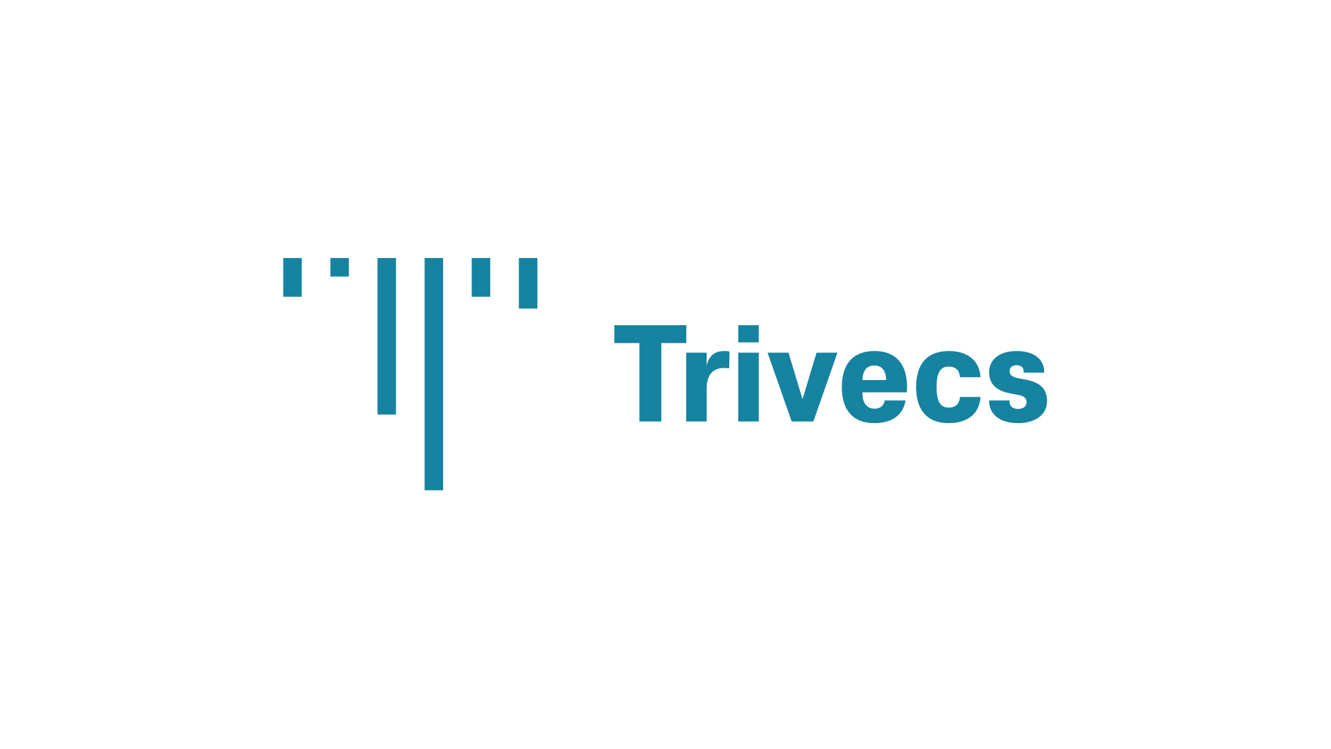
Trivecs
Deliverables
Brand Identity
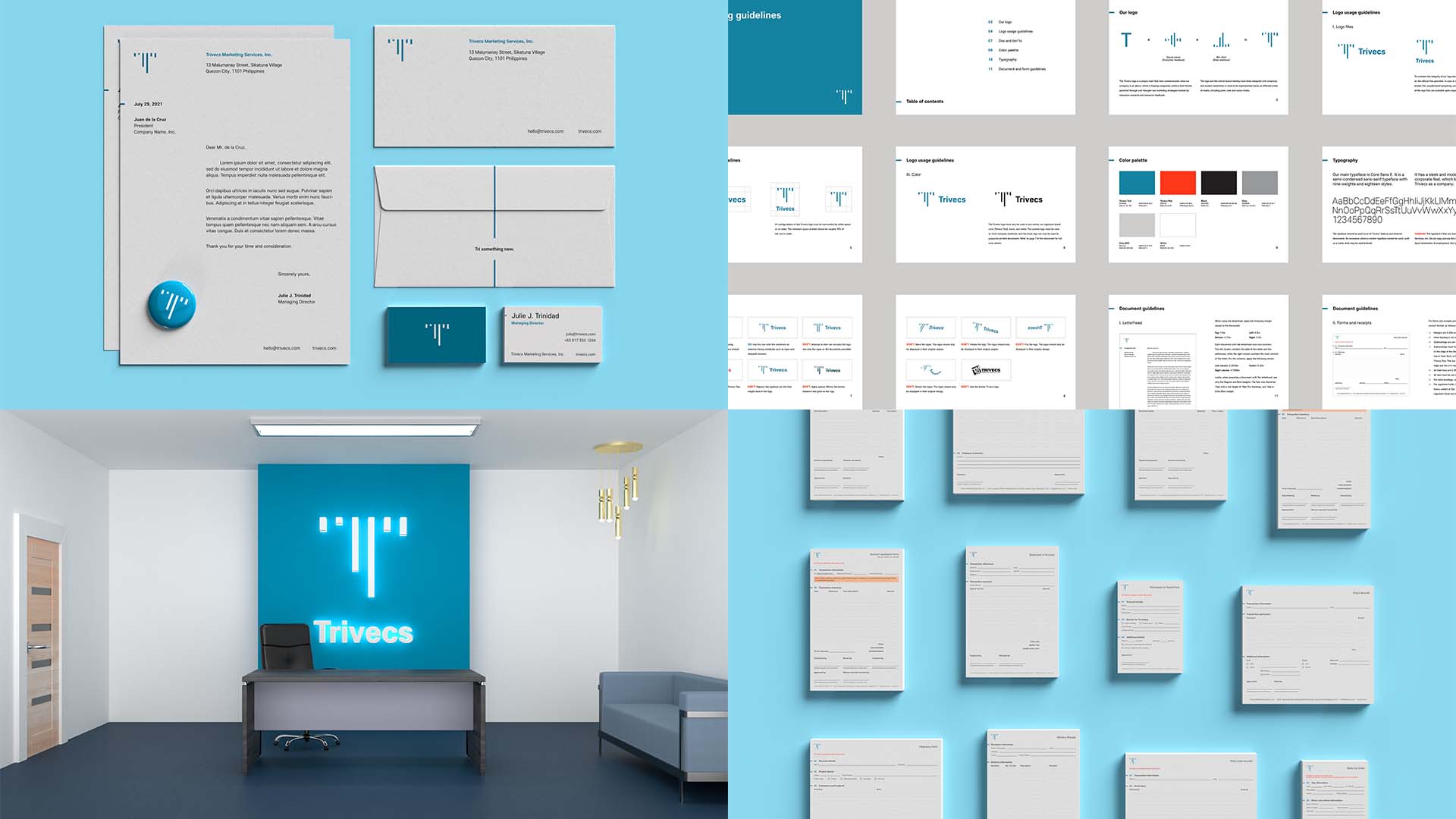
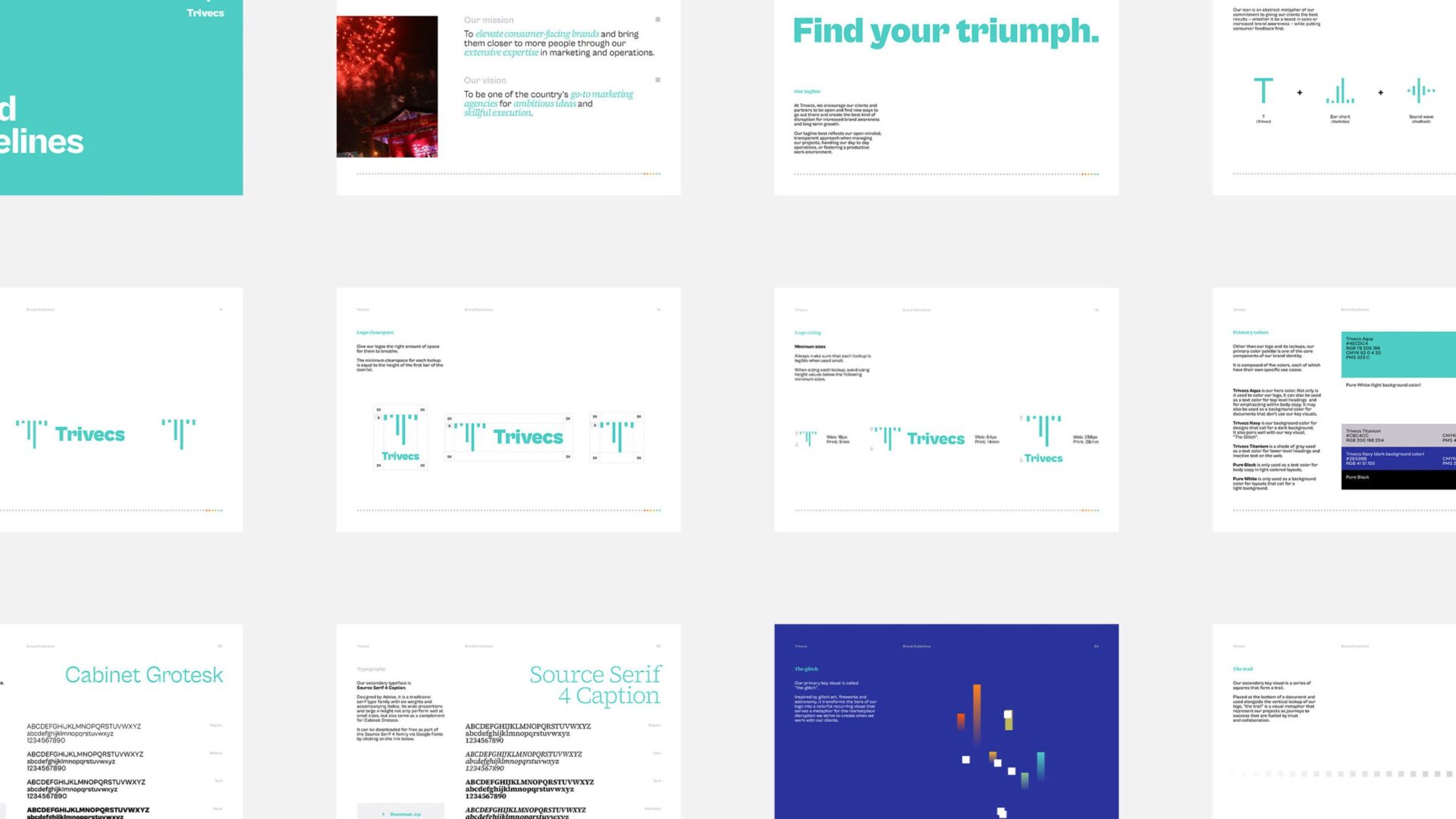
Brand Guidelines
Design Direction
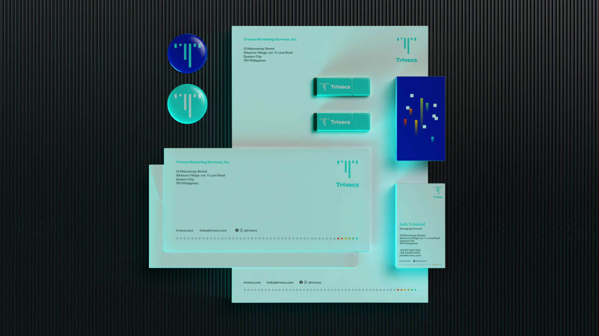
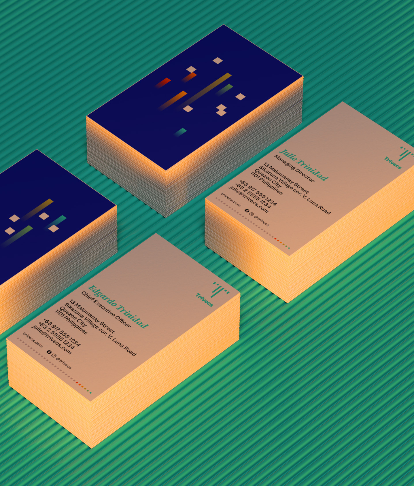
Print Design
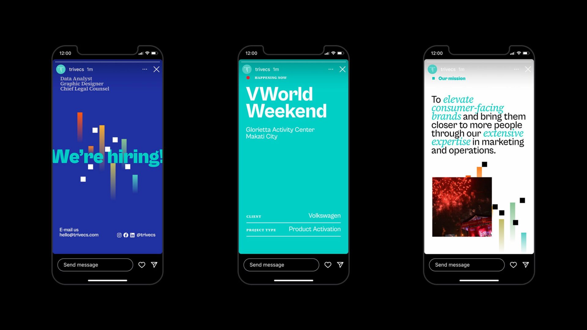
Advertising Design
Trivecs (pronounced “TRY-vecs”) is a marketing agency based in Quezon City, Philippines that specializes in marketing and activations projects, events planning, and manpower services.
Established in 1997, it works with consumer goods brands across different sectors. Past and present clients include local names like NutriAsia (UFC, Datu Puti), Purefoods, and Universal Robina and international powerhouses like Coca-Cola, Nestlé and Kraft.
To mark its 25th anniversary, I was approached by the agency to reimagine its brand identity and to help create a stronger brand presence as it starts to bounce back from the effects of the pandemic.
Samples of old identity
Approach
A Tried and True Evolution
Designed in 2015, the original iteration of the Trivecs brand identity was intended to be a sleeker, more minimalist take on corporate design compared to its competitors. However, over the years, internal feedback has shown that the company’s identity needed to evolve further and become more expressive.
Upon auditing the original identity, it is clear that Trivecs’ brand design needed to evolve but not too drastically. The refreshed identity not only includes a subtly-tweaked brand mark but also revised brand elements that make up to form a brand personality that is bolder and more expressive yet still buttoned up.
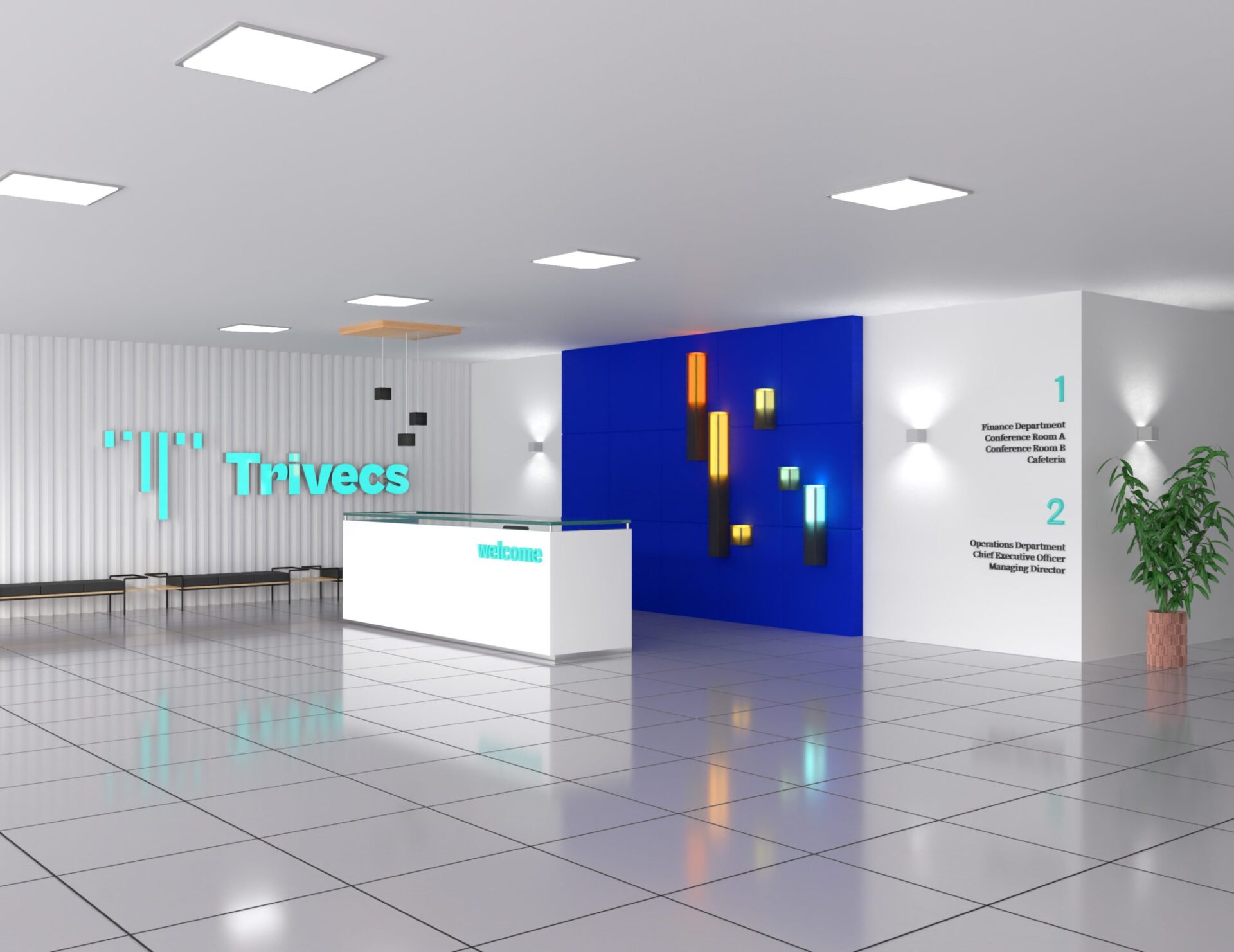
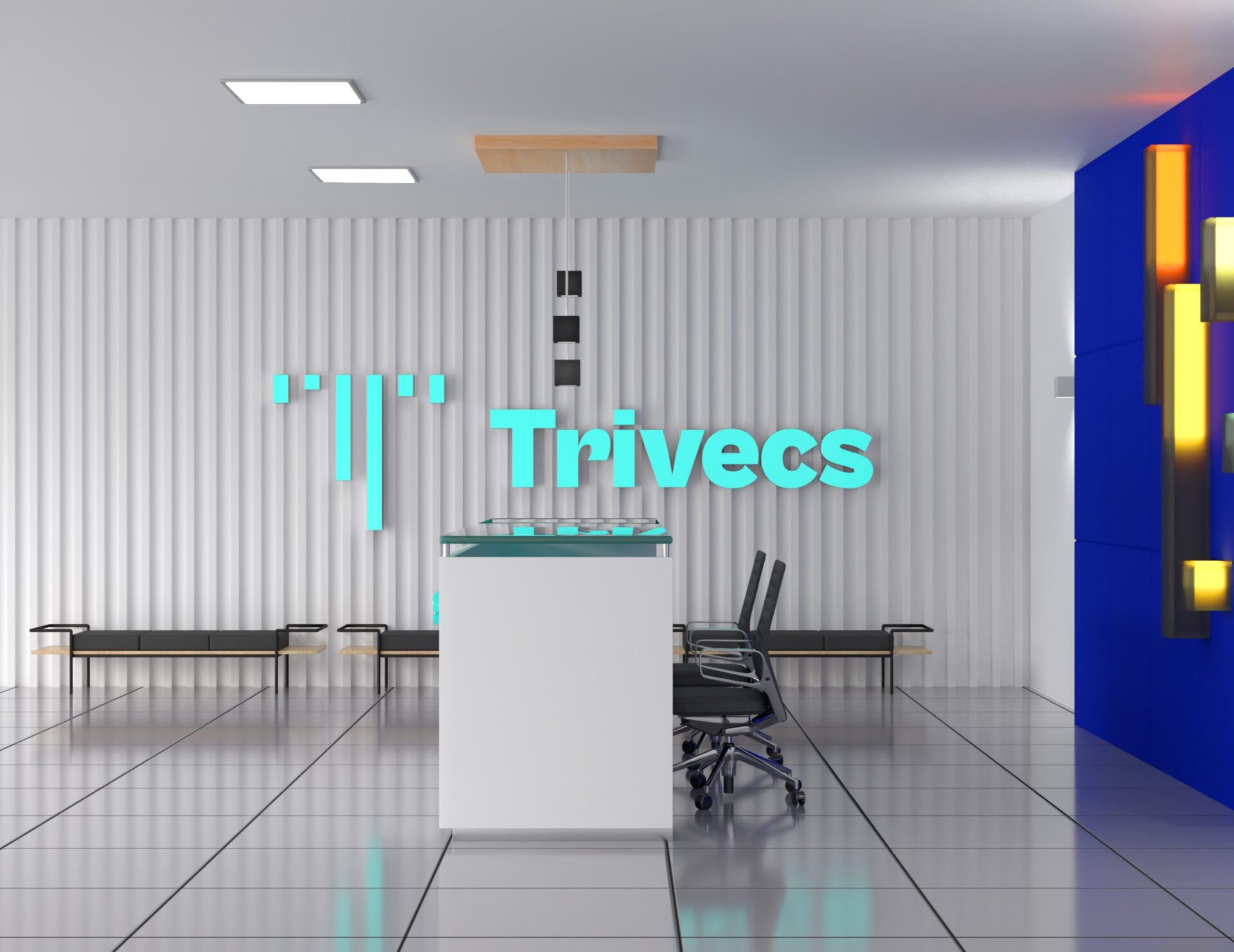
Reception area design concept
Logotype
A Tribute to Positive Outcomes
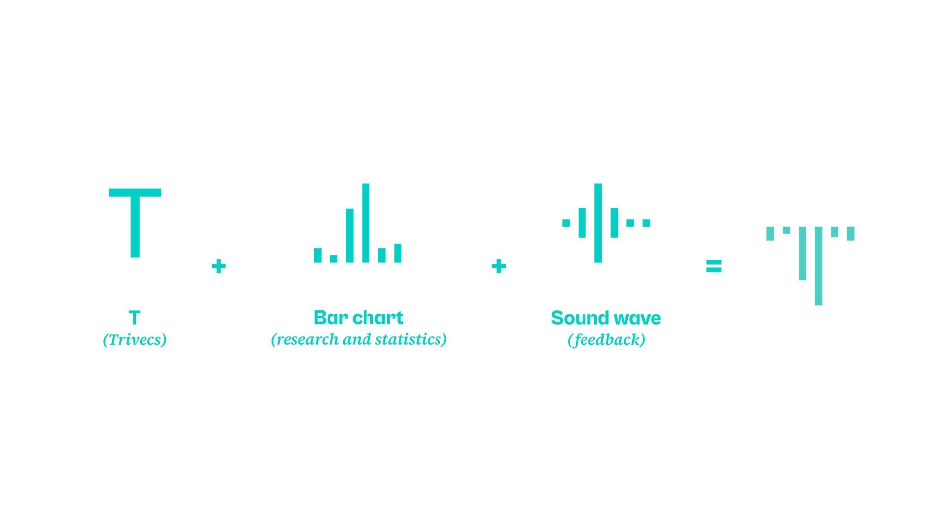
Originally designed in 2015, The Trivecs “T” icon is a simple mark that embodies the company’s commitment to helping bring brands to people and achieve the best outcomes possible, with consumer feedback and engagement front and center.
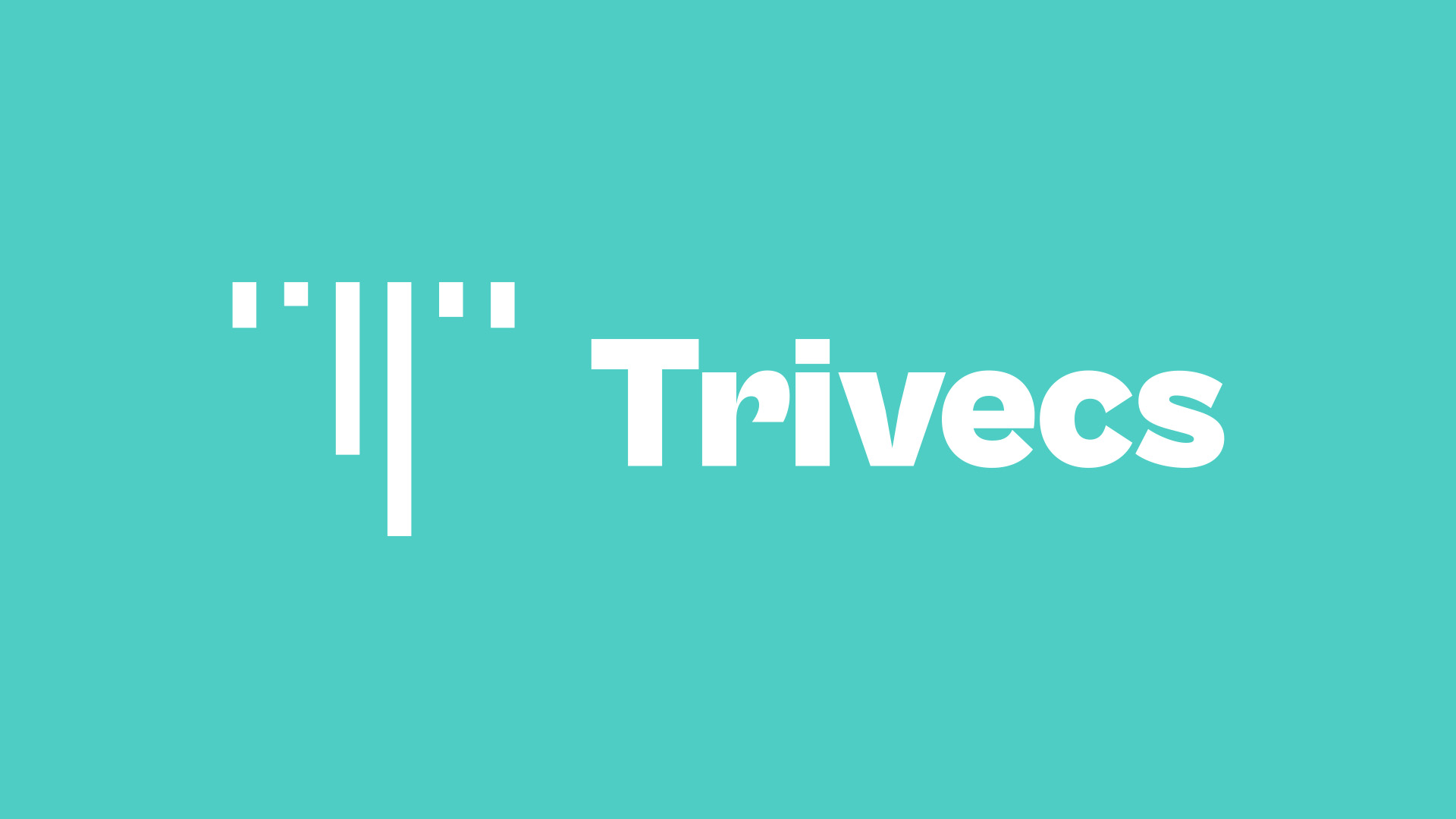
Identity
A Triumphant Glow Up
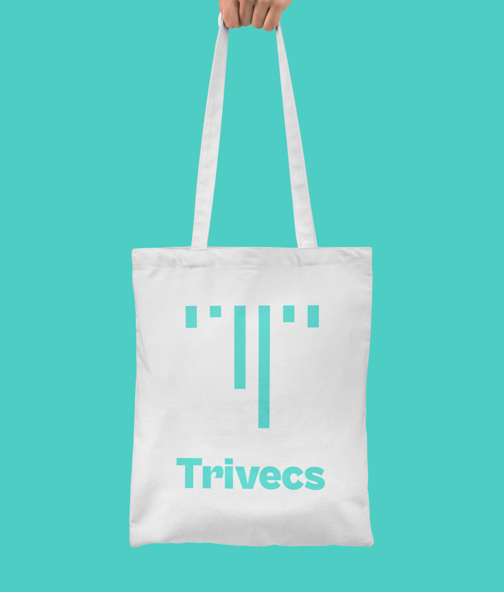
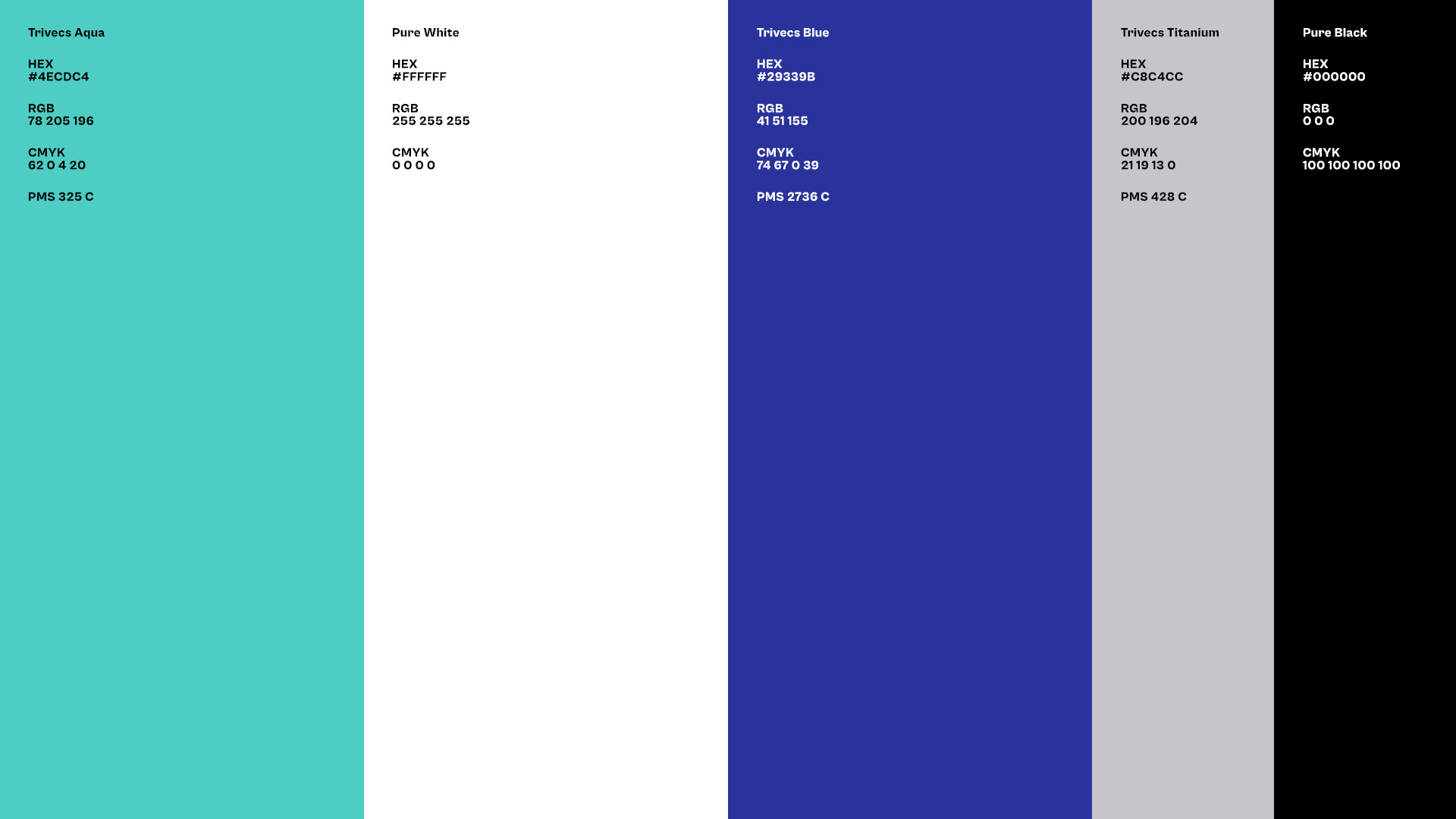
The refreshed Trivecs visual identity starts with an updated take on the agency’s brand mark. Although its design has been kept mostly intact, the mark has been remastered to better perform in small sizes.
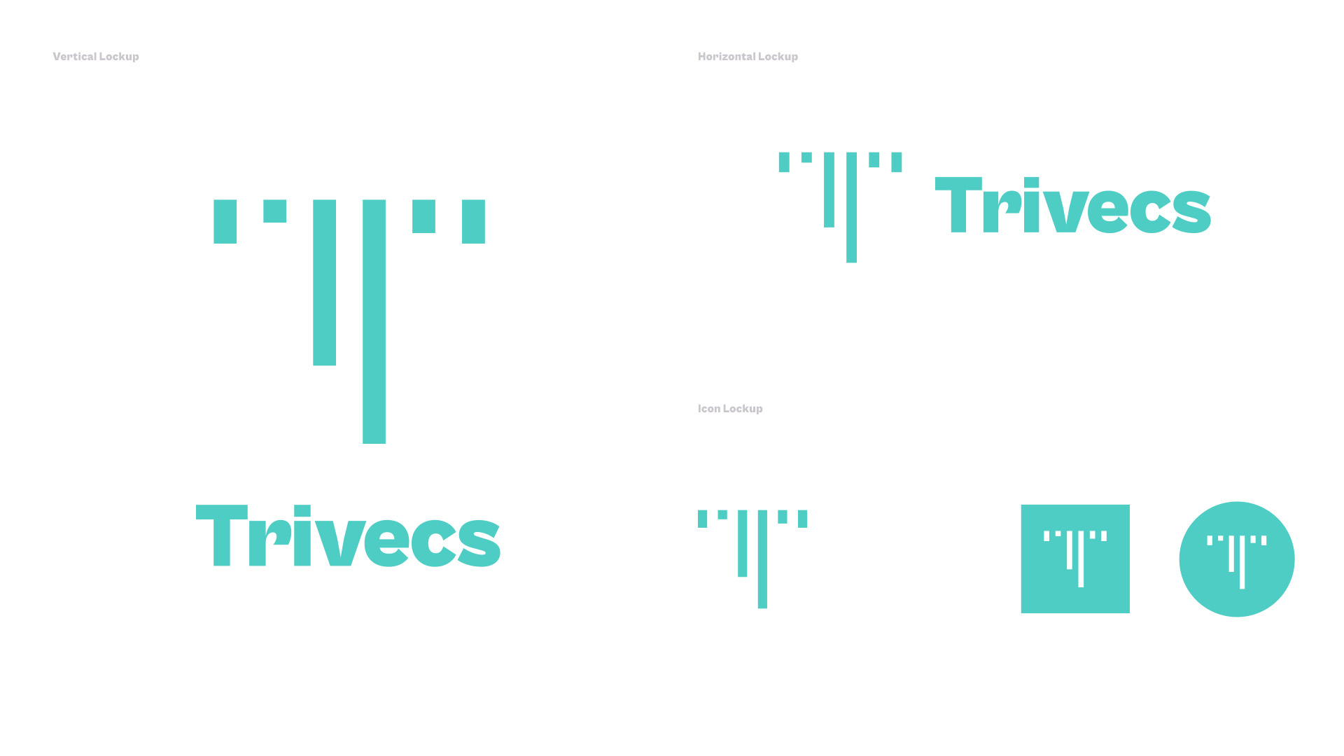
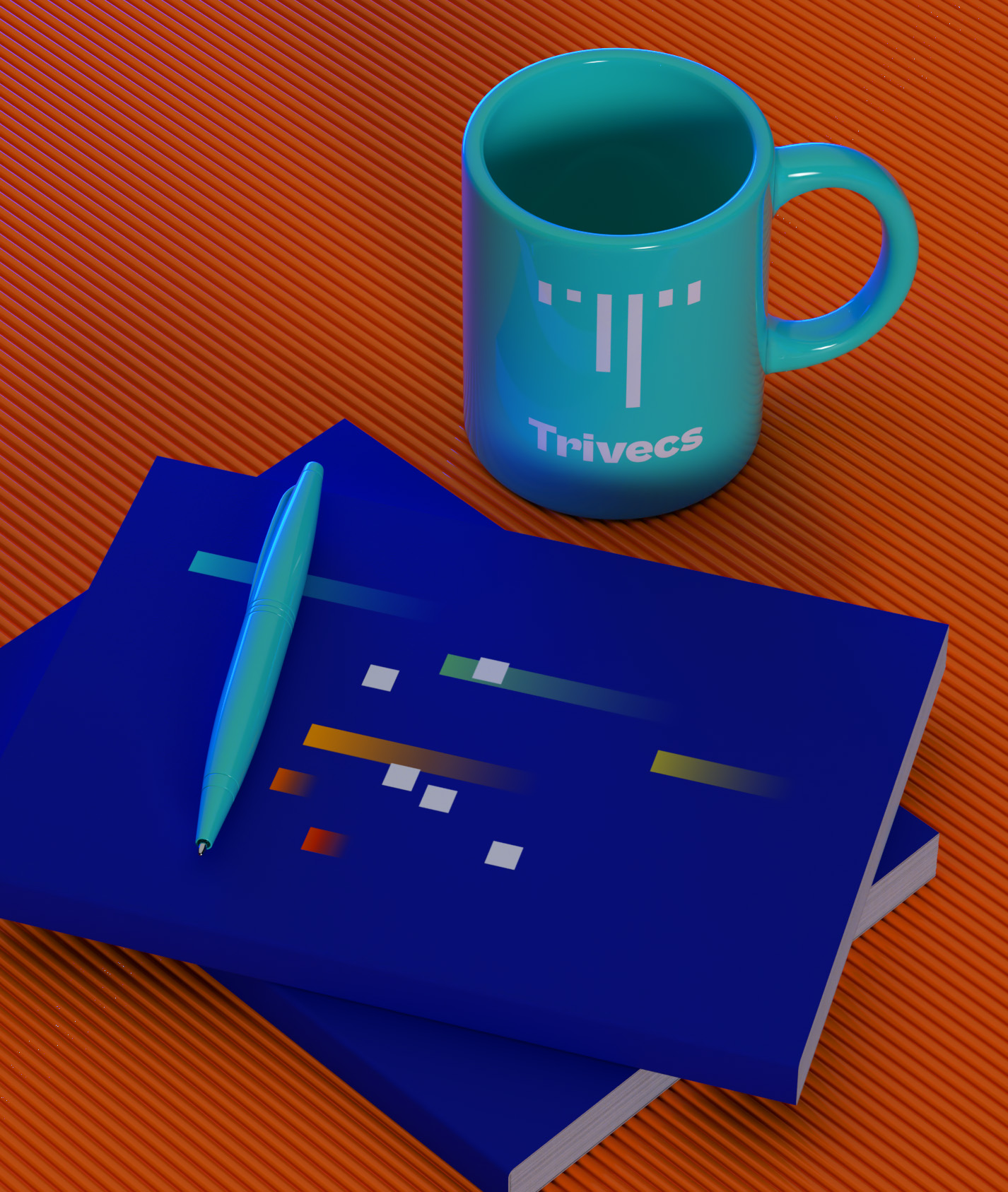
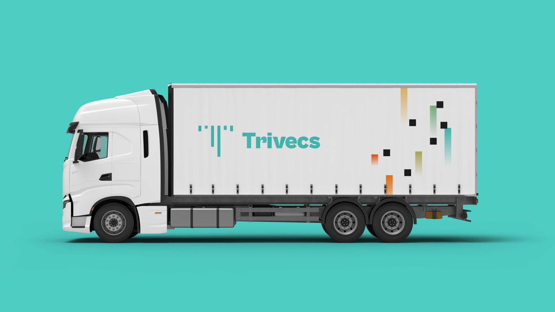
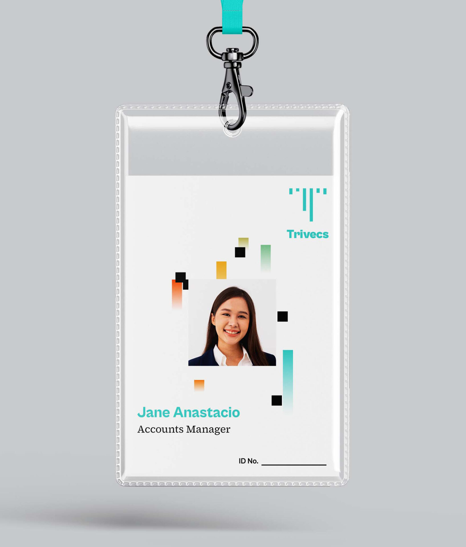
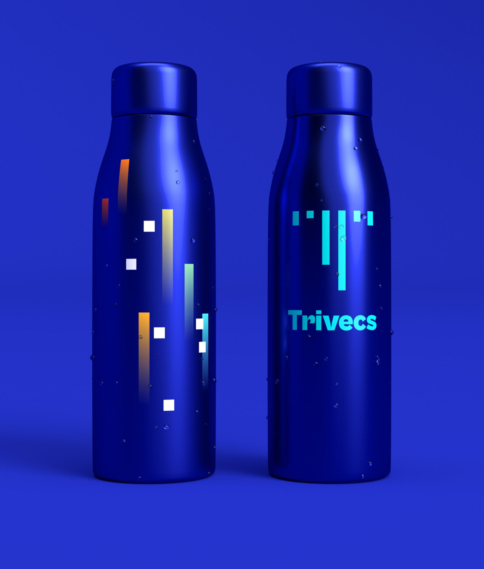
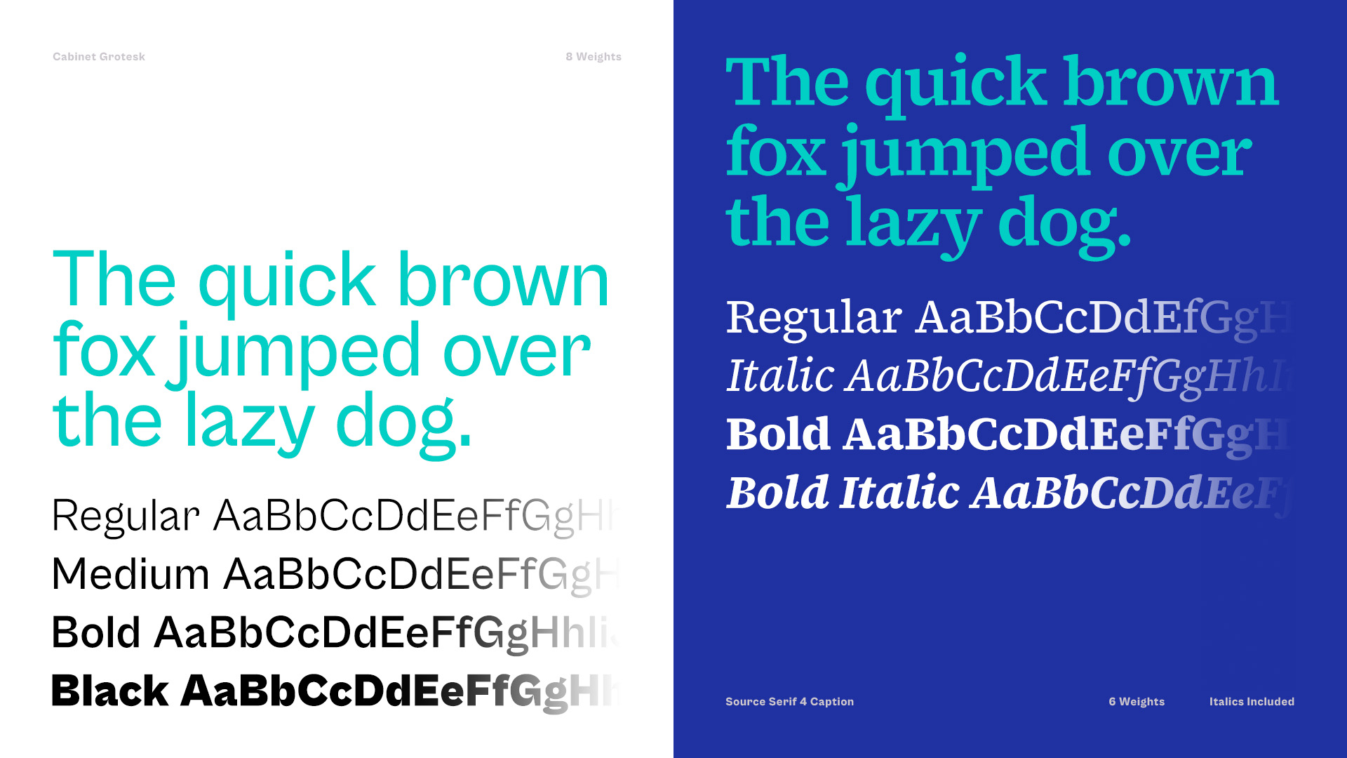
The rest of the identity has been rethought from the ground up to further define and differentiate Trivecs’ brand voice. The new toolkit includes two new main typefaces, a brighter brand color, an expanded color palette and a key visual.
Key Visual
A Thirst for Disruption
Marketing is about causing the right kind of disruption by creating brand awareness. Throughout the identity, the lines in the icon have been transformed into an adaptive, colorful recurring visual inspired by glitch art and astronomy.